content
 Introduction
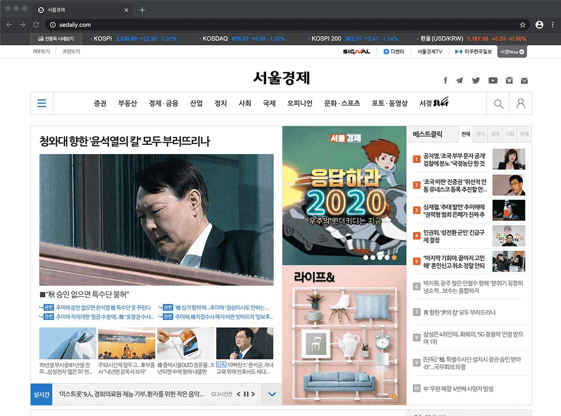
'Seoul Economic Daily' is the first economic news daily agency in Korea. The news site which is receiving much attention from Koreans reopened with the concept of ‘the first Korean responsive news site’ in 2016. I worked for the company for 3 years and I took responsibility of maintenance of the real sites. I also made big event homepages like the olympics, fairs, seminars, elections and contests, and most of the pages were made using Responsive Web which can cover all resolution of screen size. '서울경제'는 한국 최초의 경제지 입니다. 많은 한국인들의 사랑을 받고 있는 이 사이트는 2016년 ‘국내 최초 반응형 뉴스페이지’라는 컨셉으로 개편이 되었으며, 제가 3년동안 일하면서 실제 사이트의 유지보수를 맡아 진행했습니다. 올림픽, 페어, 세미나, 선거, 대회 등 큰 이벤트 페이지를 제작하였으며, 대부분의 페이지는 모든 해상도를 커버할 수 있는 반응형 웹으로 제작되었습니다.
Seoul Economic Daily site has approximately 100 pages and a very big size homepage. I always thought about loading speed and optimum codes for those sites. And those sites are designed to be readable. 서울경제 페이지만 약 100페이지가 넘는 큰 규모의 사이트 입니다. 로딩 속도와 최적의 코드로 작업이 진행되었으며, 정보의 가독성을 최우선으로 생각하여 디자인되었습니다.
-
 Work period
작업기간
2016.03 ~ 2019.02
Work period
작업기간
2016.03 ~ 2019.02
-
 Contribution
참여도
HTML+CSS 100%, jQuery 90%, Javascript(Front) 60%
Contribution
참여도
HTML+CSS 100%, jQuery 90%, Javascript(Front) 60%
-
 Program for use
사용프로그램
Bracket, Browser(ie7~11, Chrome, Firefox, Safari) Kwah4.0, CCA, Juicy Studio Accessibilty, Jquery, Javascript, Photoshop, Illustrator
Program for use
사용프로그램
Bracket, Browser(ie7~11, Chrome, Firefox, Safari) Kwah4.0, CCA, Juicy Studio Accessibilty, Jquery, Javascript, Photoshop, Illustrator
-
 Tag
키워드
CSS, HTML, jQuery, Javascript, reacive Web
Tag
키워드
CSS, HTML, jQuery, Javascript, reacive Web
Why are you making 'Responsive Web sites'? 반응형 웹을 만드는 이유
Fifty percent of my portfolio sites are Responsive Web. Responsive Web is a website that responds to all screen pixels with a single URL without a mobile separate site. One advantage is that developers don't have to mange each server. On the other hand, a disadvantage is that I have to design and code to respond to all resolutions. And professional skills on the Responsive Web should be supported. The decision to create a mobile separate site or a Responsive Web should be made according to the planning stage or the characteristics of the homepage. There is no definite answer here. But I prefer a responsive web that is easier to read at all resolutions, even if it takes a little longer to build and it's tricky to build. 제 포트폴리오의 절반 정도가 반응형 웹을 포함하고 있습니다. 반응형 웹은 모바일 별도 사이트 없이 하나의 URL로 모든 해상도에 반응하는 웹사이트 입니다. 때문에 개발자들이 서버를 각각 관리해야 할 필요가 없다는 장점이 있습니다. 대신 모든 해상도에 반응하도록 디자인하고 코드를 만들어야 한다는 단점이 있습니다. 또한 반응형 웹에 대한 전문적인 스킬이 뒷받침 해주어야 할 것입니다. 모바일 별도사이트를 만들지, 또는 반응형 웹을 만들지는 기획단계나 홈페이지의 특성에 맞게 정해져야 합니다. 확실한 정답은 없지만, 제작시 시간이 조금 더 걸리고 제작하는게 까다롭더라도 저는 모든 해상도에서 읽기가 편한 반응형 웹을 선호합니다.

Point

- Stock Table증권 테이블
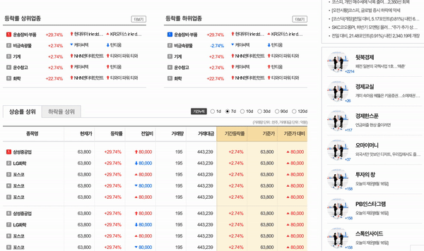
- 증권 카테고리에는 약 20가지 스타일의 주식표와 차트가 포함되어 있습니다. 이 테이블들은 모바일 버전에서 모바일 전용 테이블로 변화합니다. 또한 모든 사이즈의 스크린에서 테이블이 반응하여 움직입니다. Stock menu contains about 20 styles of stock tables and charts. These tables change at a mobile version to mobile-only tables style. The table also reacts and moves on screens of all sizes.
- As per image ratio이미지 비율 그대로
- 반응형 웹을 다루는데 능숙하지 않은 사람들은 보통 콘텐츠의 높이를 설정하거나 스크립트 플러그인에 의존해 제작하는 경우가 많습니다. 하지만 저는 이미지의 비율 그대로 줄어드는 것을 원했기 때문에, 많은 콘텐츠들이 가진 고유의 비율대로 줄어들게 만들었습니다. 또한 저는 이러한 기능을 CSS로 사용하고 있습니다. People who are not good at handling the Responsive Web usually set the height of image contents or rely on script plug-ins to produce it. But because I wanted the image to be reduced to the ratio of the image, I made it smaller than the original ratio of a lot of the content. And I'm using this as a CSS.
- Mobile Design모바일전용 디자인 적용
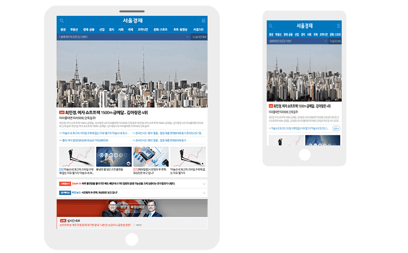
- 해상도 900px부터는 모바일 디자인으로 변화합니다. 모바일에서 홈페이지에 접속하는 것이 아니여도, 스크린의 사이즈가 줄어들면 홈페이지는 모바일 디자인으로 자동 변환됩니다. 대부분의 데이터는 한 소스로 두 버전이 함께 사용합니다. 소스를 같이 공유하되, 부적합 하다고 생각되어지는 소스코드는 모바일 버전으로 따로 별도 분리하고 제작 하였습니다. The resolution of 900px changes to mobile design. Even if you're not accessing your home page from a mobile site, when your screen size shrinks, your home page automatically changes to mobile design. Most data is used in two versions together as one source. The source code, which is thought to be unsuitable, was separated into mobile versions and produced.
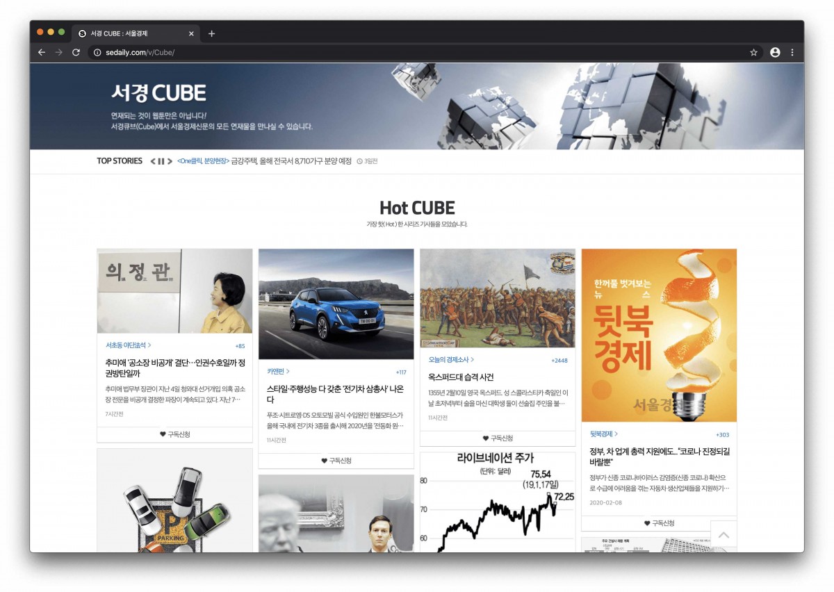
- Cube서경큐브
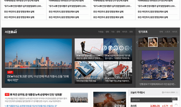
- CUBE는 다양한 분야의 기자들이 매주 일련의 이야기를 기획하고 재미있는 내용을 들려주는 페이지 입니다. 이 페이지는 어떤 크기의 이미지라도 들어오게 하기 위해 고안 되었습니다. CUBE is a page where reporters from various fields plan and tell a series of interesting stories every week. This page is designed to allow images of any size.
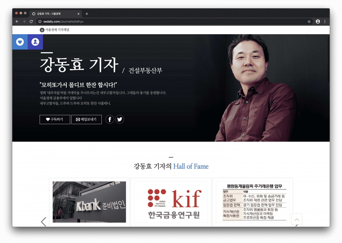
- Reporter Channel기자채널
- 각 리포터는 자신의 미니 홈페이지를 만들 수 있습니다. 머리에는 각각 간단한 문장과 그림이 그려져 있으며, 그 밑에는 기자가 최근 쓴 글들이 모아져 있습니다. Each reporter can make his or her own mini homepage. Each has a simple sentence and picture on the header, and underneath it is a collection of recent writings by the reporter.
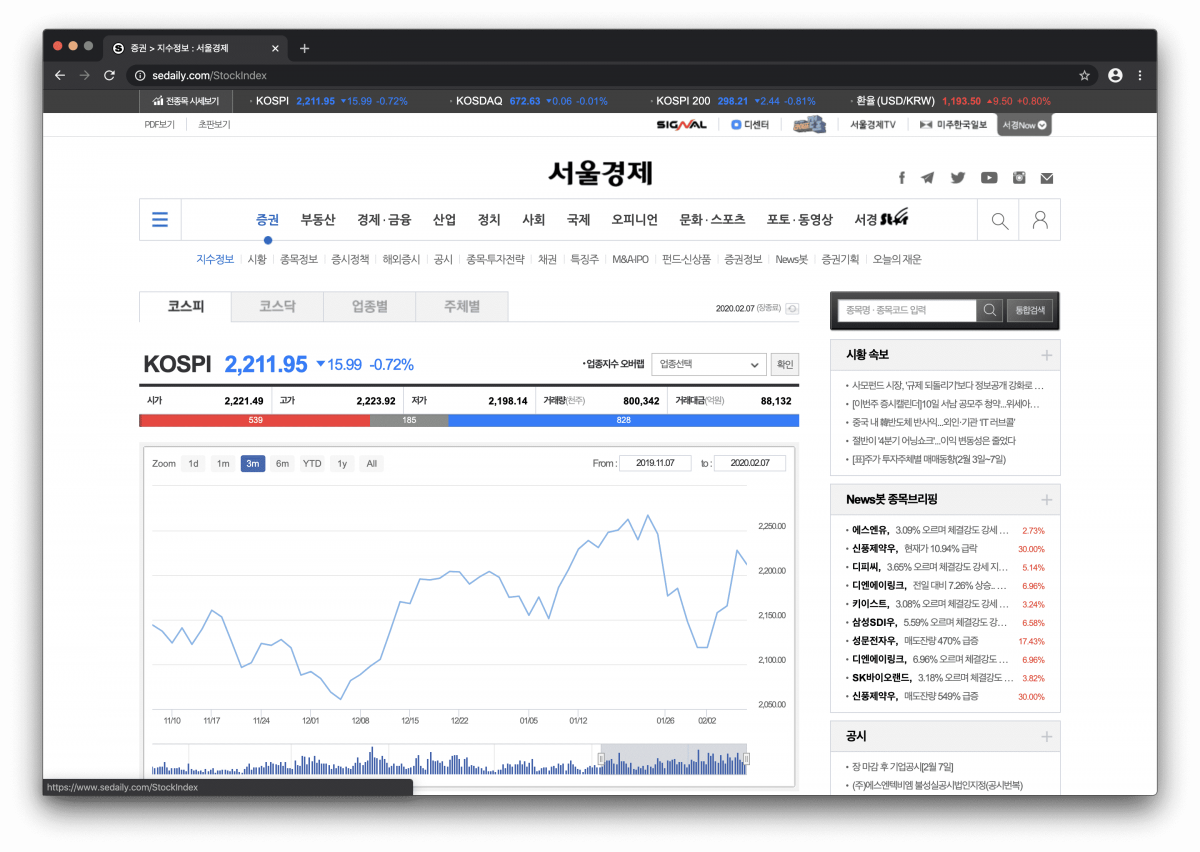
- Stock증권
- 20페이지가 넘는 주식 흐름 페이지 입니다. 그들에 관한 주식과 기사들의 현재 흐름은 주로 구성되었습니다. 해당페이지는 10여 개의 다양한 테이블로 주식 정보를 보여줍니다. This shows stock flow with more than 20 pages. The current flow of stocks and articles about them are mainly made up. I made 10 different tables showing stock flow.
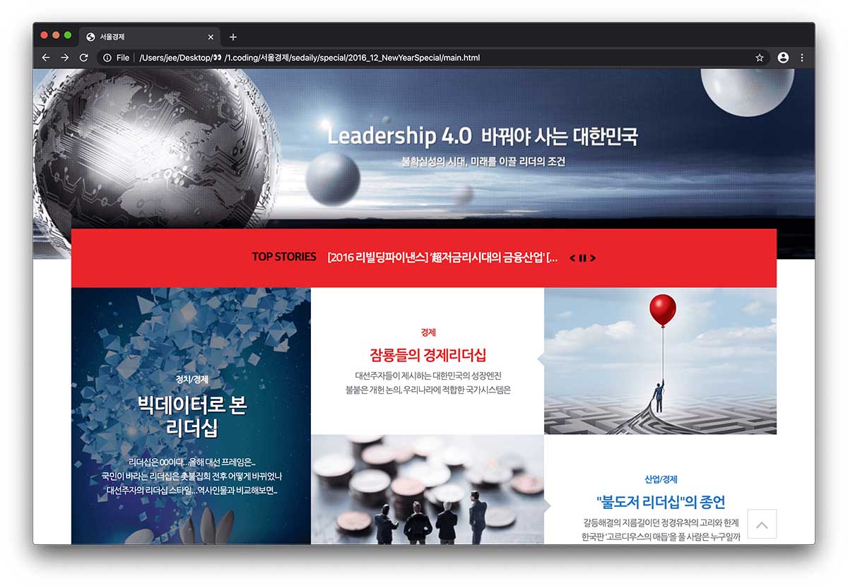
- Leadership 4.0리더십 4.0
- 서울경제의 신년 특집으로 기획된 원 페이지 사이트입니다. 이 페이지 또한 반응형으로 제작되었습니다. Leadership 4.0 is a one page site for New Year’s. This page also was made using Responsive Web.
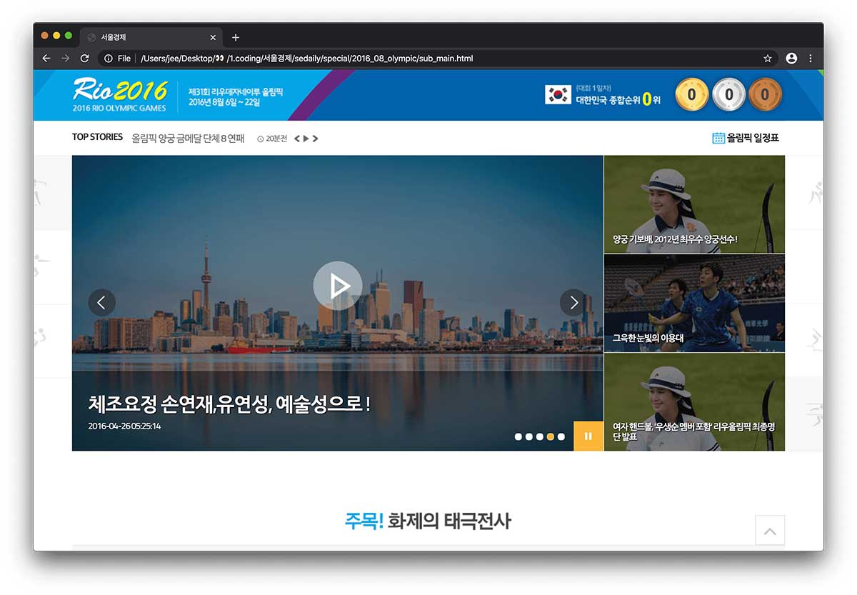
- Olympic올림픽
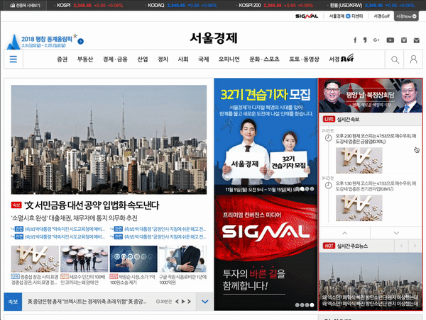
- 2016 리우 올림픽, 2018 동계 평창 올림픽에 대한 특집 페이지 입니다. 서울경제 홈페이지 안에 속한 특집 페이지이기 때문에 역시 반응형을 기반으로 하고 있습니다. These are the Olympic special pages from the 2016 Summer Rio Olympics and 2018 Pyeongchang Winter Olympics. Also these were made by the Seoul Economic Daily, so they belong to the Sed Daily site with Responsive Web function.
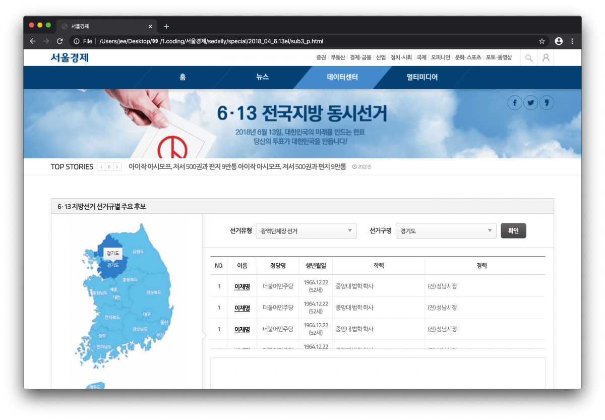
- Election선거
- 대한민국 지방선거 실시간 결과 페이지 Here are Real-time results pages for South Korea's local elections.
 Links
Links
2019년 2월 이후 실제 사이트는 포트폴리오와 다를 수 있음을 알려드립니다. Please note that after February 2019, the actual site may be different from the portfolio.
-
 Site Map
*
is recommended
표시는 추천페이지
Site Map
*
is recommended
표시는 추천페이지
-
Company Introduction회사소개
-
Baeksang Economic Institute백상경제연구원
-
News뉴스
-
Application지원신청
-
Stock증권
-
Photo포토
-
Special Pages스페셜 특집